

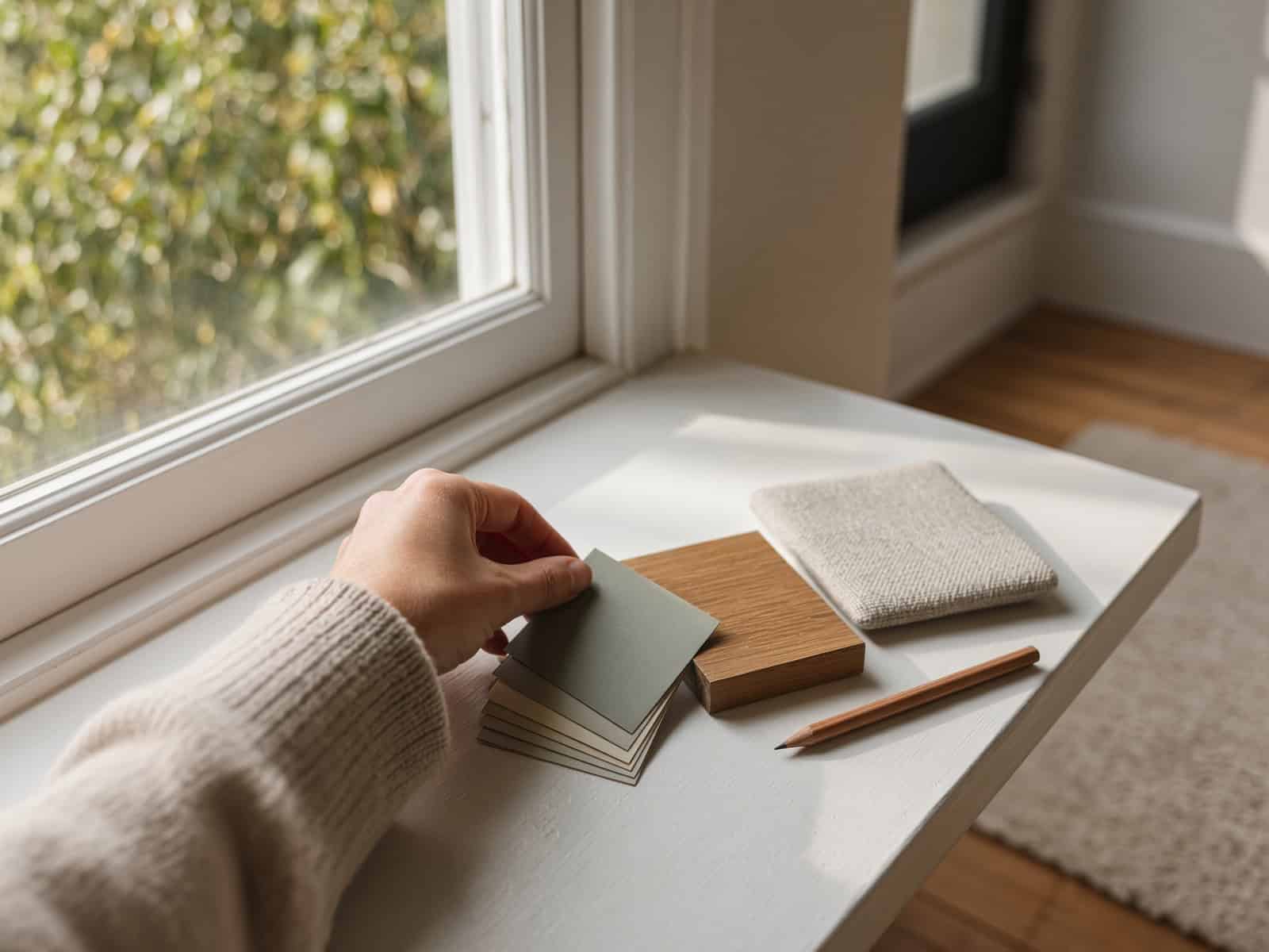
How to Choose a Renovation Colour Scheme for Your Auckland Home
Last updated:
Quick answer: The easiest way to choose a renovation colour scheme is to work from what you can’t change (flooring, benchtops, tiles, roof and joinery), lock your undertone as either warm or cool across the whole home, then build a palette using roughly 60% main colour, 30% secondary and 10% accent. Test every shortlisted colour on the wall in Auckland’s morning and evening light before you commit.
Most people start a renovation colour scheme at the wrong end. They fall for a paint colour on a phone screen, buy ten litres, and only work out it reads green against the timber floor once the first wall is done. By then the tiles are ordered and the cabinetry colour is locked, so the “wrong” wall has to bend around everything else.
Colour is one of the few renovation decisions that touches every room and costs very little to get right on paper. It’s also one of the easiest to get wrong once materials are on site. This guide walks through the exact order we use on our own projects, the undertone trap that catches most Auckland homeowners, two worked palettes you can copy, and how to test properly before anything is bought.
Free cost calculator
How much will your renovation cost?
Answer a few questions and we’ll email you an Auckland price range.
Start With What You Can’t Change
Paint is the most flexible thing in your renovation. A wall colour can be swapped for the price of a few litres and a weekend. Flooring, benchtops, tiles, the roof and your window joinery are the opposite: they’re expensive, they’re locked in for 15 to 30 years, and they set the mood of the room whether you plan around them or not.
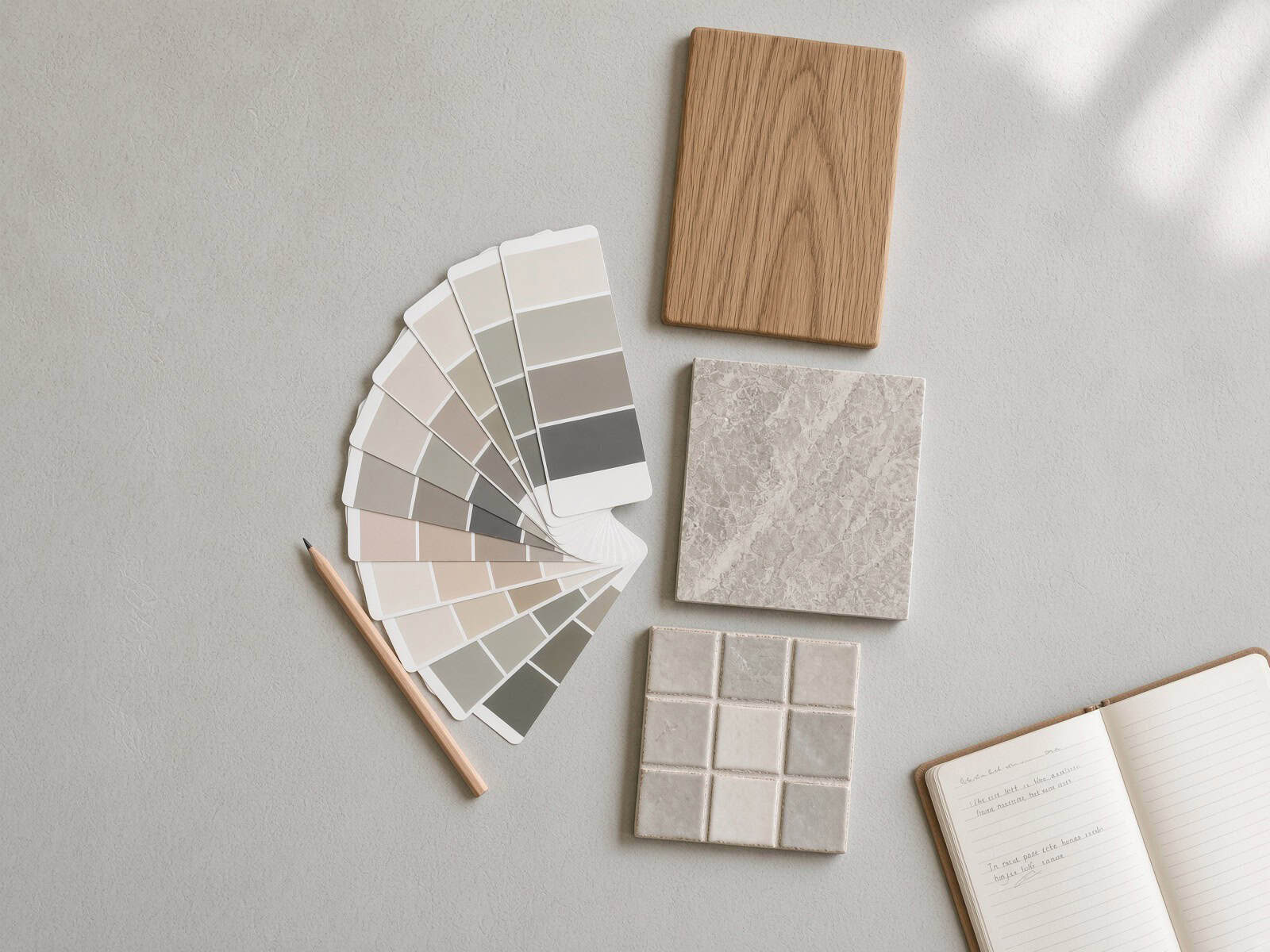
So the palette starts there. Pull together the actual samples of every fixed material in the project, a timber floor offcut, the benchtop chip, the tile, the tapware finish, the carpet, and lay them on the bench together in daylight. That collection is your brief. Every paint colour after this has one job: to make those materials look intentional.
Why the Fixed Elements Win
A warm oak floor with a honey tone will fight a crisp blue-grey wall. Not because either is wrong, but because they’re pulling in opposite directions. Match the wall to the floor’s temperature and the same room suddenly feels resolved. This is the single biggest reason a scheme reads “off” when every individual choice looked fine in the shop.
It matters even more in older Auckland stock. A Grey Lynn villa with Rimu floors and a lot of native timber carries a warmth you either lean into or fight the whole way through. A 1990s home in Albany with tiled floors and aluminium joinery is cooler and more neutral to start with, which gives you more freedom on the walls.
💡 Quick tip: If your budget won’t stretch to changing the flooring this round, treat it as a fixed element and build the whole palette around it. Fighting a floor you’re keeping is the most common colour regret we see.
Tiles are worth singling out. In a kitchen or bathroom the tile usually drives the grout colour, the tapware finish and the vanity or cabinetry tone, so it tends to get chosen first and the paint last. If you’re still weighing tile options, our guide on picking the right tiles for an Auckland bathroom covers how they set the rest of the room.
Your fixed-elements checklist (do this first)
- Gather a physical sample of every material you are keeping or have already ordered: flooring, benchtop, splashback, tile, tapware, carpet, roof colour chip.
- Lay them together on the bench, not held up one at a time, in natural daylight near a window.
- Decide the overall temperature the group leans, warm or cool, before you look at a single paint chip.
- Photograph the group in daylight so you can carry the “brief” to the paint shop on your phone.
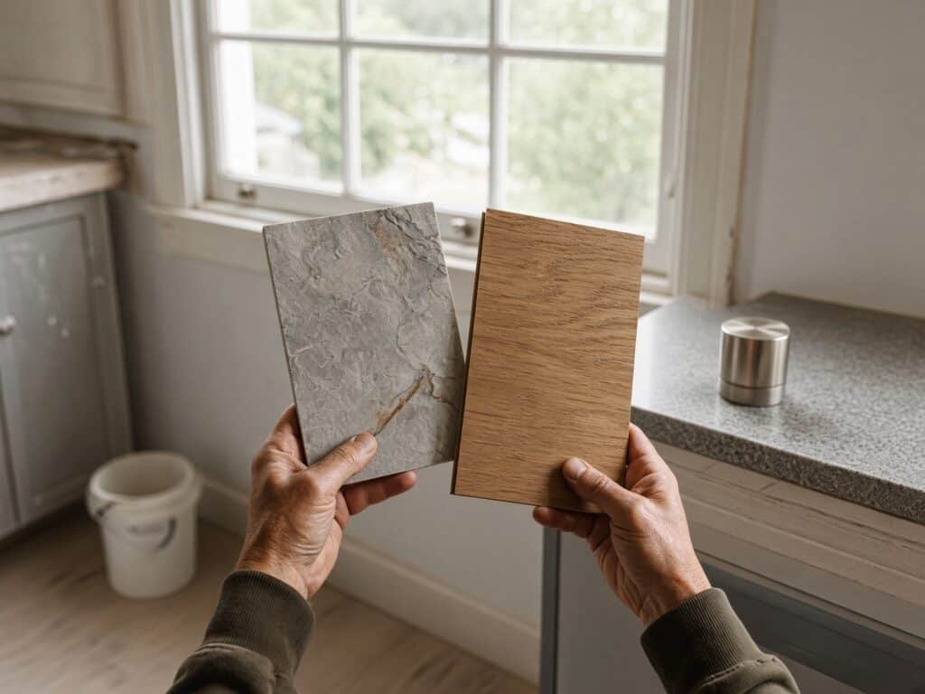
Hold your fixed materials together in real daylight before you look at a single paint chip — that comparison is your brief.
Undertones: The Trap Almost Everyone Falls Into
Here’s the part that trips people up. Every colour, and especially every white and grey, has an undertone hiding underneath it. A white can lean warm (yellow, brown, red) or cool (grey, blue, black). On the swatch it just looks white. On a wall the size of a room, the undertone takes over.
According to Resene, warm whites such as Resene Half Spanish White or Resene Quarter Thorndon Cream carry brown, yellow-green or red-violet undertones that make a room feel homely, while cool whites like Resene Black White, Resene Alabaster and Resene Barely There carry grey or blue undertones that read fresh and expansive. Pick the wrong temperature and even an expensive scheme feels cheap.
A Shortcut for Reading Undertones
There’s a genuinely useful trick buried in the Resene colour codes. The letter on a Resene white tells you which way it leans: a code starting with Y (yellow) or B (brown) is a warmer white, good for warming up a cool, south-facing room, while G (green) or N (neutral, which reads as grey against white) is a cooler white that takes the visual heat out of a bright north-facing room. You don’t have to memorise every colour, you just have to know which side of the line it sits on and whether that matches your materials.
This is also why the same white behaves so differently by aspect. In Auckland a north-facing room gets the strongest, warmest sun, so a warm white there can tip too yellow, and a cooler white keeps it calm. A south-facing room stays cool and flat, so a cool white can turn grey and cold, and a warmer white brings it back to life. The colour hasn’t changed, the light has.
“The mistake I see most often isn’t a bold colour, it’s a white that fights the floor. Someone picks a cool, contemporary white and lays it over warm timber, and the room never quite settles. Get the undertone right first and everything else falls into place around it.”
— Eunice Qin, Designer, Superior Renovations
Pick One Temperature and Hold It
The rule that keeps a whole-home scheme calm: commit to warm or cool across the house and stay there. You can absolutely use several whites in one room, walls in one, trims in another, as long as they’re all on the same side of the line. Mix a warm trim with a cool wall and the join looks like a mistake rather than a decision.
Warmer palettes have quietly taken over from the cool greys that dominated Auckland interiors for most of the last decade. Soft whites, sand tones and greige now do most of the work, partly because they sit more comfortably against the timber and natural light in a lot of Auckland homes. Trends aside, the temperature that suits your fixed materials is the one to back.
💡 Quick tip: Hold two white swatches next to each other and the undertone jumps out, one suddenly looks pink, the other grey. Always compare whites in a pair against a plain white background, never one at a time.
Building the Palette: The 60-30-10 Approach
Once the temperature is set, you need a structure so the scheme doesn’t turn into a colour-by-numbers job with a different feature wall in every room. The approach we lean on is simple: roughly 60% dominant colour, 30% secondary, 10% accent.
The 60% is your main wall and ceiling colour, the quiet backdrop that runs through most of the home. The 30% is a supporting tone, often the cabinetry, larger joinery or a considered wall colour in a few rooms. The 10% is where personality lands: tapware, a splashback, a piece of tiling, cushions, a single painted door. It’s the part you can change later without repainting the house.
Two Worked Auckland Palettes You Can Copy
Theory only gets you so far, so here are two complete schemes built the way we’d build them on site. Both use the 60-30-10 structure, they just start from different fixed materials.
The warm villa palette suits a classic Auckland villa or bungalow with rimu or matai floors and native timber joinery. The 60% is a warm white through the walls and ceilings of the shared spaces, something in the Resene Half Spanish White family that has enough brown in it to sit with the timber. The 30% is a soft greige on the cabinetry and a feature or two, warm enough not to fight the floor. The 10% is where it earns its character: aged brass or matte black tapware, a deep clay or forest-green front door, a patterned floor tile in the entry. The timber does the heavy lifting, and the paint stays quiet around it.
The cool contemporary palette suits a 1990s or newer home with tiled or engineered floors and aluminium joinery. Here the 60% is a clean, cool white like Resene Black White or Resene Alabaster that keeps the light bouncing. The 30% is a mid-grey or charcoal on the kitchen island and laundry cabinetry, and the 10% is a single confident move: black tapware, a dark tiled splashback, or one charcoal wall in a media room. The scheme reads crisp and current without going cold, because the grey is held to a third of the space, not spread everywhere.
Build your own 60-30-10 in four steps
- Pick the 60% first: one main wall colour for all the shared spaces, in the temperature your fixed materials set.
- Choose the 30% to support it, usually cabinetry or larger joinery, half a step deeper or a related tone.
- Save the 10% for the fun: tapware, a door, a splashback or soft furnishings you can swap in a few years.
- Write the three colours down as one list and carry it into every room, rather than re-deciding at each doorway.
Let the Colour Flow Between Rooms
A whole-home renovation is not five separate colour projects. The eye travels from the hallway into the living room into the kitchen, so the palette has to travel with it. The cleanest result usually comes from one consistent main colour through the shared spaces, then small shifts in the rooms that stand alone, a bedroom, an ensuite, a study.
Think of it as one scheme with variations, not a new decision behind every door. That continuity is what makes a modest home feel considered and a large one feel calm rather than chopped up.
“We plan colour across the whole floor plan before a single wall gets a coat. When you decide it room by room you end up with a house that feels like six different houses. Decide it as one flowing scheme and even a small do-up reads like it was properly designed.”
— Dorothy Li, Design Manager, Superior Renovations
💡 Quick tip: Keep your 60% and 30% colours neutral and durable, and put the trend into the 10%. That way a fashionable colour lives on a splashback or a door you can redo, not on walls you’ll be sick of repainting in five years.
Trims, Ceilings and Skirtings: The Details That Quietly Matter
Most colour advice stops at the walls, which is exactly why so many schemes look almost right and not quite. The trim, ceiling and skirting decisions are where a good palette either tightens up or falls apart, and they cost nothing extra to get right if you plan them at the same time.
Resene’s own advice for a calm neutral scheme is to use strengths of one colour rather than unrelated colours: full strength on the walls, double strength on the doors (the deeper tone helps hide fingermarks), and an eighth or quarter strength on the ceiling, then vary the sheen level from surface to surface so the differences read as intentional. One colour at different strengths always looks more resolved than three colours trying to agree.
On ceilings specifically, a stark bright white overhead can jar against a warm wall and make the room feel colder than it is. Dropping the ceiling to a quarter strength of the wall colour, or a soft white in the same temperature, keeps the whole room on one team. Skirtings and architraves in older Auckland villas are often the place to add a crisp contrast, but only if the white you choose sits on the same warm-or-cool side as everything else.
Trim and ceiling to-do list
- Choose the ceiling as a lighter strength of the wall colour, not a random bright white.
- Take doors and high-touch trims a strength or two deeper so marks don’t show.
- Keep every trim white on the same warm-or-cool side as the walls.
- Vary sheen, not colour: low sheen on walls, a harder-wearing finish on trims and doors.
Using Dark and Moody Colours Without Shrinking the Room
Dark colours are having a long moment in Auckland homes, on media-room walls, kitchen islands, front doors and whole studies. They can look superb, but they carry more risk than a soft neutral, so they need a bit of planning rather than a brave weekend.
Warm, deep colours visually close a room in, which is wonderful in a snug media room and a problem in a small, low-light bedroom. Dark schemes work best where you already have good natural light and a bit of ceiling height, or where you actually want the room to feel enclosed and cosy. In a tight, north-facing box of a room, a dark colour can make it feel smaller and gloomier rather than moody.
If you want the drama without the risk, keep the dark colour in the 10 or 30% of your palette rather than the 60%. One charcoal feature wall, a black-stained island or a deep-green study reads as considered. The same colour on every wall of a poorly lit room usually reads as a mistake. Test dark colours even more carefully than pale ones, because they change dramatically between daylight and lamplight.
Auckland Light Changes Everything, So Test On the Wall
A colour is only ever as good as the light it sits in, and Auckland light is not neutral. A north-facing living room gets warm sun most of the day and will push a colour warmer. A south-facing bedroom stays cool and flat, and can turn a grey cold and blue. Bush suburbs like Titirangi throw a green cast off the trees; a west-facing room gets hot orange evening light. The same colour genuinely behaves differently on two walls of one house.
This is why testing on a screen or off a small swatch fails. You have to see the actual colour, at scale, in the actual room.
How to Test Paint Properly
Resene’s advice is to paint two coats of each shortlisted colour onto a large card (A2 is ideal), leave a white border around the edge so the eye reads the colour cleanly, then move the card around the room and check it in daylight and again under your artificial lighting at night. Painting a patch straight onto an existing wall colour is misleading, because the old colour bleeds into how you read the new one.
Give it a day or two. Morning light and 8pm lamplight are different worlds, and the colour you loved at breakfast can fall apart at dinner. It’s a small delay that saves repainting a whole house.
Paint-testing to-do list
- Paint two coats of each shortlisted colour onto an A2 card, not straight onto the wall.
- Leave a white border around each card so your eye reads the colour cleanly.
- Move each card around the room, and check the darkest corner as well as the brightest spot.
- Look at it in morning light, afternoon light and under your night-time lamps before deciding.
- Live with the shortlist on the wall for a day or two before you buy a single litre.
💡 Quick tip: Test the colour on the wall that gets the least natural light as well as the brightest one. If it still works in the dark corner, it works everywhere. If you only test it in the sunny spot, the hallway will disappoint you.
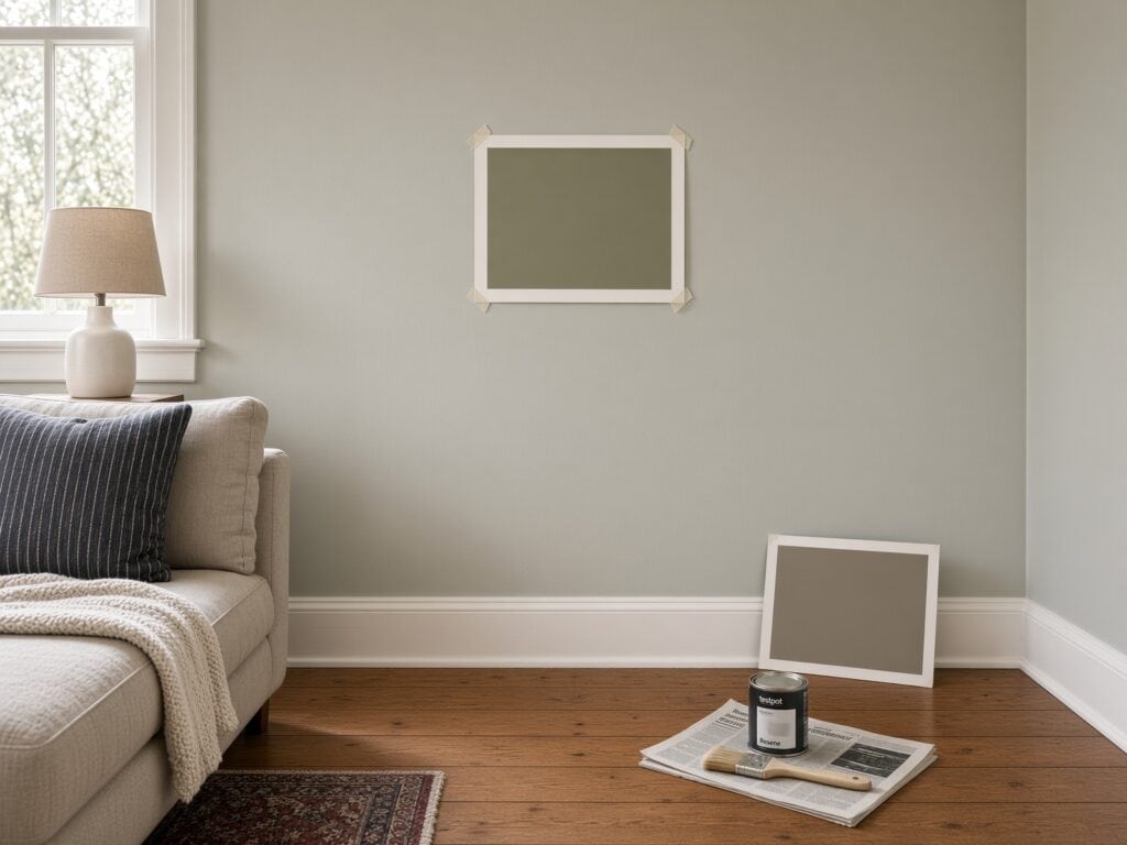
Two coats on an A2 card, taped to the wall, checked in real daylight — this is how you actually test a colour before you commit.
Colour is closely tied to the paint spec itself, sheen level, quality and how many coats, all of which affect both the look and the cost. If you’re pricing the painting side of a renovation, our guide on what it costs to paint a house in Auckland breaks down interior, exterior and roof ranges for 2026.
Don’t Forget the Exterior
A whole-home renovation is a rare chance to bring the outside and inside onto the same page, and it’s the step most people leave until the scaffolding is already up. The exterior has its own fixed elements: the roof colour, any brick or stone, the driveway, and often the neighbour’s houses on either side. Those set the temperature for the weatherboard or plaster and the joinery just as the floor sets it inside.
The cleanest exterior schemes usually run three tones, a main body colour, a trim, and a door or accent, which is the 60-30-10 idea again at a larger scale. A charcoal roof pairs comfortably with cool greys and crisp whites; a warmer tile or Coloursteel roof sits better with soft off-whites and clay tones. Match the front-door colour to something you’re carrying inside and the transition from street to hallway feels deliberate rather than accidental.
💡 Quick tip: Check any exterior colour against your resource consent and, if you have one, your covenant, before you commit. Some Auckland developments and heritage areas limit exterior colours, and it’s far cheaper to know before the painters arrive.
Colour and Resale: Where to Be Brave, Where to Be Safe
If you might sell within five years, colour is worth a second thought, though not in the way most people assume. You don’t have to paint everything a safe greige. You just have to keep the bold, personal choices in the parts of the palette that are cheap to change.
Buyers respond to homes that feel calm, light and move-in ready, which a consistent whole-home neutral delivers almost on its own. Keep your 60 and 30% broad and durable, and let the 10% carry any personality, because a buyer can repaint a single door far more easily than a whole house of a colour that isn’t theirs. A cohesive, well-tested neutral scheme is one of the lowest-cost, highest-impact things you can do before a sale.
How We Handle Colour In-House
Choosing colour is a lot easier when you can see it before it’s built rather than imagining it from a fandeck. That’s the main reason we brought design fully in-house rather than leaving it to chance on site.
Every project runs through our Auckland design studio at Wairau Valley, where the colour scheme, materials and layout are settled on paper before any work starts. Our designers put together concept plans and 3D renders so you can see the palette in your actual space, walls, cabinetry, flooring and light, and adjust it while changes still cost nothing. By the time the first wall is painted, every colour decision has already been made and signed off.
It’s the same thinking behind our in-house design department: one team owns the look of the whole renovation, so the colour that gets approved on the render is the colour that goes on the wall. Cabinetry runs through our own workshop as well, which keeps finishes consistent with the rest of the palette rather than ordered blind from a catalogue.
If you’d rather work colour through with a designer than guess at it, that’s exactly what the studio is for. You can also see how the whole process fits together on our design-to-build process page.
Putting Your Renovation Colour Scheme Together
Get the order right and colour becomes the cheap, high-impact part of a renovation instead of the risky one. Start from the materials you’re keeping, lock a single warm-or-cool undertone across the home, build a 60-30-10 palette that flows room to room, sort the trims and ceilings as lighter strengths of the same colour, and test every shortlisted colour on the wall in Auckland’s own light before you buy a drop.
Do that and the scheme looks resolved for the price of a few test pots, rather than a repaint you didn’t budget for.
➡ Book your free in-home consultation with Superior Renovations
➡ Try our free renovation cost calculators
➡ Request a free feasibility report for your project
Frequently Asked Questions
How do I choose a colour scheme for my home renovation?
Start with the elements you can't easily change, flooring, benchtops, tiles, joinery and roof, and build the palette around them. Lock a single undertone (warm or cool) across the whole home, then structure the colours roughly 60% main, 30% secondary, 10% accent. Test every shortlisted colour on the wall in both daylight and evening light before buying. Working from fixed materials first is the step that keeps the scheme looking intentional rather than pieced together.
What is the 60-30-10 rule for colour?
It is a simple structure for balancing a palette: about 60% of the space in a dominant colour (usually walls and ceiling), 30% in a secondary tone (often cabinetry or larger joinery), and 10% in an accent (tapware, a splashback, a painted door, soft furnishings). Keeping the 60% and 30% neutral and putting any trend-led colour into the 10% means you can refresh the look later without repainting the house.
What are undertones and why do they matter?
An undertone is the subtle colour hiding under a paint, most noticeable in whites and greys. A white can lean warm (yellow, brown, red) or cool (grey, blue, black). On a small swatch it just looks white, but across a full wall the undertone takes over. Resene groups warm whites like Resene Half Spanish White separately from cool whites like Resene Black White for this reason. Matching the undertone to your fixed materials is what stops a scheme feeling off.
Should I use the same colour throughout the whole house?
Not identical, but connected. The cleanest whole-home result usually runs one consistent main colour through the shared spaces (hallway, living, kitchen) so the eye travels smoothly, then makes small shifts in rooms that stand alone, like a bedroom or ensuite. Treat it as one scheme with variations rather than a separate decision behind every door. That continuity is what makes a home feel calm and considered rather than chopped into unrelated rooms.
Why does paint look different in my Auckland home than in the shop?
Because light changes colour. A north-facing room gets warm sun and pushes colours warmer, a south-facing room stays cool and can turn a grey blue, bush suburbs like Titirangi cast a green tint, and west-facing rooms get hot evening light. Shop lighting is nothing like any of these. The only reliable test is a large sample on your own wall, viewed in both daylight and your night-time lighting.
How do I test paint colours before committing?
Paint two coats of each shortlisted colour onto a large card (A2 works well) and leave a white border around the edge so you read the colour cleanly. Move the card around the room and check it in morning light, afternoon light and under your lamps at night. Give it a day or two before deciding. Painting straight onto the existing wall colour is misleading, because the old colour affects how you see the new one.
Should I pick paint colours before or after flooring and tiles?
After. Flooring, tiles and benchtops are expensive, long-lived and hard to change, so they set the direction and paint should follow. Tiles in particular tend to drive grout, tapware and cabinetry choices, so they are usually selected first and paint last. Choosing paint first and then trying to find flooring to match is the harder, more expensive way round and often ends in compromise.
Are warm or cool colours better for a New Zealand home?
Neither is universally better, it depends on your fixed materials and light. That said, warmer palettes, soft whites, sand tones and greige, have largely replaced the cool greys that dominated Auckland interiors over the past decade, partly because they sit more comfortably against timber floors and natural light common in local homes. The right choice is the temperature that suits the materials you are keeping, held consistently across the house.
How many colours should a renovation colour scheme have?
Fewer than most people expect. A main colour, one or two supporting tones and a small number of accents is usually enough for a whole home. A tight palette repeated with small variations reads as designed, while a different colour in every room reads as busy. The 60-30-10 structure keeps the count low and the result cohesive, most calm interiors are built on a handful of colours used well, not many colours used sparingly.
What colour should I paint the ceiling and trims?
A reliable approach is to use one colour at different strengths: full strength on the walls, a lighter eighth or quarter strength on the ceiling, and a deeper strength on doors and high-touch trims (which also helps hide fingermarks). Vary the sheen level from surface to surface rather than introducing unrelated colours. Keep every trim and ceiling white on the same warm-or-cool side as the walls, so the whole room reads as one considered scheme rather than several competing whites.
Can I use dark or moody colours in a small room?
You can, but plan it. Deep, warm colours visually close a room in, which suits a cosy media room or study but can make a small, low-light bedroom feel smaller and gloomier. Dark colours work best where there is decent natural light and some ceiling height, or where you genuinely want an enclosed, snug feel. If you are unsure, keep the dark colour to a feature wall or a single element rather than every wall, and test it carefully in both daylight and lamplight, because dark colours shift more than pale ones.
Can Superior Renovations help me choose colours?
Yes. Every renovation runs through our in-house design studio at Wairau Valley, where colour, materials and layout are settled before work starts. Our designers produce concept plans and 3D renders so you can see the palette in your own space and adjust it while it still costs nothing to change. You can book a free in-home consultation to talk it through, or book a paid design service if you want a full end-to-end scheme developed with a designer.
Further Resources for your renovation
- Featured projects and Client stories to see specifications on some of the projects.
- Real client stories from Auckland
- How to approach the layout and material side of a project in our guide to space planning in a home renovation
Need more information?
Take advantage of our FREE Complete Home Renovation Guide (48 pages), whether you’re already renovating or in the process of deciding to renovate, it’s not an easy process, this guide which includes a free 100+ point check list – will help you avoid costly mistakes.
Download Free Renovation Guide (PDF)

Have you been putting off getting renovations done?
We have partnered with Q Mastercard ® to provide you an 18 Month Interest-Free Payment Option, you can enjoy your new home now and stress less.
Learn More about Interest-Free Payment Options*
*Lending criteria, fees, terms and conditions apply. Mastercard is a registered trademark and the circles design is a trademark of Mastercard International Incorporated.
Still have questions unanswered?
Book a no-obligation consultation with the team at Superior Renovations, we’d love to meet you to discuss your renovation ideas!


