Kitchen Displays At Our Auckland Showroom: Detailed Breakdown
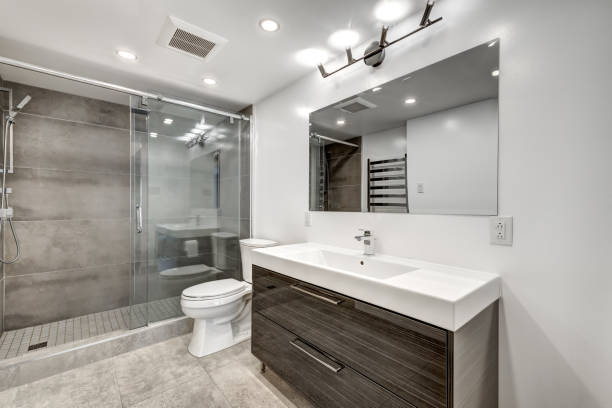
We have recently opened a renovation showroom in Auckland with 3 displays of renovated kitchens, 5 displays of renovated bathrooms as well as a design studio. We are the first of its kind in New Zealand as this is not just a manufacturer’s showroom but a showroom where our clients can see the quality of our workmanship as well as explore the myriad of renovation materials that are available today.
Our showroom was created to highlight essential storage in kitchens, the different range of revolutionary materials available today as well as different kitchen designs.
With the creation of this showroom, we decided that it would be a good idea to create an article explaining the different materials used in our kitchen showroom display designs and their features as well as benefits for families. The idea is to educate our clients about the revolutionary and innovative renovation materials available today.
Table of contents:
- Difference between our showroom and other kitchen showrooms in Auckland ⇓
- Our lead renovation designers Cici and Dorothy – examples of their prior work ⇓
- Highlighting our modern matte black kitchen in our kitchen showroom ⇓
– Overall design highlight
– Premium Acrylic boards for cabinets – features and benefits
– Leather finish benchtops – Features and Benefits
– Silgranit Sink – What exactly is Silgranit?
– Soft close technology for cabinets
– No handle set up + Push open cabinets
– Maximising storage solutions in a sleek kitchen
– Waterproof Laminate floors
– who are these types of materials/kitchens good for? - Highlighting our Classic kitchen in our Kitchen showroom ⇓
– Overall classic design explained
– highlighting 60mm polished benchtop
– Handcrafted cabinet fronts
– Feature walls
– Premium luxury materials - Contemporary Kitchen in our Kitchen showroom ⇓
– How to achieve a great design which is budget friendly
– Premium Acrylic cabinet fronts Vs Mid-range acrylic cabinets
– Combination of different materials to create a contemporary style
– Creating continuity with benchtop and splashback
– Why is this kitchen more budget friendly than the other two?
Renovation showroom vs Kitchen manufacturer’s showroom – Why we are different? ⇑ (Back to the top)
Chances are that if you are renovating your kitchen, you are also changing its flooring, painting the walls, and moving electric sockets around. With kitchen manufacturing companies you will have to find the additional trades, handle supply deliveries, and manage the process.
Most showrooms that you see in Auckland are kitchen manufacturing companies that have a showroom where they display their quality of kitchens. You will mostly meet a designer that designs your kitchen which is then manufactured and installed at your home. They do not however provide other trades like electricians, builders, plumbers, painters, or a project manager. You will also have to go to flooring companies to select your flooring, choose a painting company, and organise other trades.
Need ideas? Check out our Kitchen Design Gallery or dive into our Bathroom Design Gallery for inspiration!
Our Renovation showroom in 16D Link drive, Wairau Valley, Auckland. Our renovation showroom has 3 kitchen displays, 5 Bathroom displays, a Design studio and 100s of renovation materials for you experience. We encourage our clients to visit our showroom to see the quality of our workmanship.
In our case, we are a renovation company that specialises in project management. When renovating a kitchen with us, our project manager will come to your home and measure your kitchen are and discuss your design ideas. Our lead kitchen designers Dorothy and Cici will then create your kitchen design using CAD and sketch up. Our project manager will then give you a fixed quote and with all the specifications for your project as well as timeline.
Before accepting our quote, we would encourage you to visit our showroom to see the quality of our workmanship. Once you have accepted our proposal, we will first finalise your kitchen design and once approved, it will be manufactured in Auckland which would take from 2-3 weeks.
While the kitchen cabinets and benchtops are being manufactured, we will take you to our flooring, lighting appliance supplier showrooms to select all your other fittings for the kitchen. We will then install your cabinets and benchtop, install your flooring, and provide all trades like electricians, flooring installers, painters, plasterers, plumbers, builders and you will have a dedicated project manager to oversee the entire renovation process.
Cici and Dorothy – Our in-house Renovation and Kitchen designers (Examples of their kitchen designs)– ⇑ (Back to the top)
Cici and Dorothy come with an extensive experience in designing renovation spaces which are functional yet beautifully designed. They both worked together to create our kitchen showroom displays as well as our bathroom showroom displays. They create initial designs on sketch up but also create 3D renderings and models using CAD for our renovation clients. They are an asset to our company not just because they are very good designers but they also have extensive knowledge about the evolving renovation materials of today.
A kitchen renovation in Massey – Take a look at the design phase behind this Kitchen renovation.
The kitchen renovation pictured below was designed by Dorothy and managed by our project manager Jin. It was primarily designed to renovate a closed off kitchen into an open plan kitchen with an area to entertain.
The pictures below show the transformation of a kitchen renovation that we carried out in Massey, Auckland. The kitchen was a closed off room which was demolished an open plan living which is often why many of our clients get their kitchens renovated. A bar area was also created which was extended from the kitchen. Dorothy and our client decided to use the same renovation materials as well as cabinetry for the kitchen as well as bar to maintain continuity in the overall kitchen design.
Before the kitchen renovation | Design draft 1 |
Design Draft 2 | After the Kitchen was Renovated |
Design drafts Vs Reality of the kitchen
Elevation 1 Kitchen design Vs Completed Kitchen
Elevation 2 Kitchen design Vs Completed Kitchen
Elevation 3 Kitchen design Vs Completed Kitchen
Other drafts initial designs
1st Display – Modern Matte Black kitchen in our Kitchen showroom in Auckland ⇑ (Back to the top)
Dorothy designed this kitchen for our kitchen showroom keeping a minimalistic and sleek design in mind. This kitchen also highlights different storage solutions as well as in cabinet organisation that you can incorporate in your kitchen design to make it more functional.
This kitchen showroom display also highlights the revolutionary renovation materials that are available today. These renovation materials ensure that cleaning up and prolongs the durability of the kitchen.
![]()
The key features of this kitchen showroom display includes:
- Premium Acrylic boards on MDF boards for all kitchen cabinets and drawers
- Stone engineered benchtop with a leather finish
- Timber Veneer boards for floating shelves
- Glass Splashback
- Downdraft rangehood on the island
- Large induction stove on the island
- Hidden fridge and dishwasher
- Pull our rubbish and recycling bins
- Full length pull out pantry with drawers
- Pull out condiment cabinet
- Magic corner for corner cabinet
- Hidden drawers
- Soft close cabinet and drawers with a push open technology
- Silgranit sink with a insinkerator
- Waterproof SPC laminate floors
Design stages for the kitchen display done by Dorothy
You can see some of Dorothy’s preliminary designs for this display for our kitchen showroom. This is one of our most interactive kitchens in our showroom because practically all storage and appliances are hidden behind the cabinets. Our clients spend most of their time on this kitchen because there is always a surprise behind each cabinet/drawer that they open.
As mentioned above, the materials and and functionality of this kitchen makes it a unique kitchen display. The materials are innovative and revolutionary for the families of today. Kitchens are no longer serve the same purpose that they did in the past. They are now a hub of entertainment and often a place that the whole whole family congregates around in the evenings or for a quick breakfast before school or work.
It is no longer a separate room but a room in the living space with an open plan setting. Children and adults often cook their meals together which makes it important that the materials used to create your kitchen are durable and easy to clean/maintain.
“I wanted to show our clients that you can achieve a sleek and minimalistic look for their kitchen design without compromising on storage or functionality. Storage solutions of older kitchens are often either bulky or inconvenient for accessibility. The materials especially are an highlight for this kitchen because they are very durable and easy to clean.” explains Dorothy when asked about her vision for this kitchen showroom display.
Most people renovate their kitchens or even homes only once or twice in their lifetime which means that there is a serious lack of knowledge about the renovation materials of today. Our aim through this article is to educate our clients about the materials that we use as a renovation company as well as the materials in our kitchen showroom displays.
Read more…
10 Mistakes to avoid when designing your kitchen by our in-house kitchen designers
How much does it cost to renovate a kitchen in NZ (2022)
Cabinets and panels for all cabinetry – What are they actually made of?
All the cabinets and drawers fronts in this matte black kitchen are made of premium acrylic that is pressed on FSC certified MDF. The carcass or framework of the cabinetry is made of particle board.
Premium Acrylic panels on MDF boards for all the cabinet and drawer fronts. Recessed Veneer below the stone engineered countertop gives the benchtop an appearance of floating.
What is MDF?
MDF or Medium density fibreboard is manufactured or engineered in a factory. It is made by breaking down any scrap/residual parts of hardwood which are bound with wax and resin. High pressure and temperature is applied to this to make them into panels.
Premium Acrylic panels by Laminex
We have used Laminex’s premium acrylic decorative boards which are pressed on the locally made FSC certified MDF. They have a great depth of colour with a matte finish that is made smooth to almost feel like velvet.
These panels are beautiful yet durable and very easy to clean. Some of the features of these premium acrylic panels are as follows:
- They are fingerprint resistance – this means that you will not have to keep wiping off finger prints from the cabinets.
- They are easy to clean as they do repel dust
- They are scratch resistant – this is great especially for kitchens where it is easy to scratch the fronts by sharp objects.
- Stain resistant – The fact that these cabinets cannot be stained means that you don’t have to worry about wiping any spillage immediately while cooking.
- They are soft to touch and come with a 10 year warranty.
The panels we have chose for our kitchen showroom display is Metallic coal but it does come in 8 other colours which gives you alot of options when designing your kitchen.
When you open one of our hidden drawers, you will see all the other colours that you can use to customise your kitchen in the style that you would like.
Benchtop used in this kitchen display
The benchtop is also engineered stone with a concrete look. Dorothy wanted this kitchen to have an overall matte finish for all its materials and hence the benchtop also has a matte finish. We work closely with the supplier UniQuartz that create beautiful stone engineered benchtops.
This benchtop is also soft to touch like the acrylic panels and has a leather finish (which means its not polished but has texture when you touch it).
The key features of this material is as follows:
- It is stain resistant – this is great for when you are cooking and you don’t have to worry about any spills staining your benchtop
- They wont crack easily if you put a heavy put or if something drops on it unexpectedly from any top cabinets.
- They can withstand up to 410 degree Celsius without any damage to it.
- You can wipe any spills easily with a cloth or paper towel
- It has a textured feel to it when you touch it with a concrete look
The top edge of the benchtops have a shark nose that gives the benchtop a floating quality. This can be seen in the picture below.
![]()
All the floating shelves are made of Veneer board with a crown cut. Veneer board is basically MDF with real timber on the surface. The floating shelves add warmth to the kitchen and cut the monotony of the matte black cabinets. It also allows clients to display ornaments, crockery or wine making the kitchen homely.
Read more…
No handle set up + technology used in cabinets
This kitchen does not have any knobs or handles to open the drawers or cabinets. All the lower cabinets have a shark nose at the edge, making it easier to grip and open them. There is a veneer board recessed strip between the benchtop and cabinet edge which has an LED light strip making it easier to see where you open the cabinets in the dark.
All the top cabinets use a ‘push open’ technology to open the cabinets which simply means that you push the cabinet and it opens. As the cabinets are finger print resistant, you will not find any fingerprint marks when you touch the top cabinets.
All the cabinet and drawers use a ‘soft close’ technology which reduces means that even if you slam the cupboards, they will slow down and close softly. This is great as it reduces noise in the kitchen and especially when young kids are in the kitchen.
Glass mirror splashbacks – Why a glass mirror splashback was used for this kitchen showroom display?
Tiles have always been the most popular choice for splashback for kitchens. Glass mirror splashbacks have seen a growth in popularity recently especially for modern and contemporary kitchen designs.
This glass mirror splashback in our kitchen showroom is coloured black to match the overall kitchen design. Contrary to popular belief, this splashback is resistant to heat as it is made of toughened glass and will will not break easily. Using glass mirrors is also a way of making your kitchen look more spacious. Glass splashbacks are also easy to clean compared to tiles as there are not grout lines.
Extensive Storage solutions for your kitchen design – Making organisation easy
Most of our kitchen renovations include making the kitchens into an open plan kitchen. Open plan kitchens often have the living and dining area in the same space as the kitchen. While open plan kitchens promote family interaction, they also pose a problem. The problem is that open plan kitchens need to look presentable and uncluttered at all times as they are visible from other living areas. This means that you should be able to store all your big appliances, condiments, pots and pans inside the cabinets comfortably.
Dorothy says that the ease of retrieving your appliances/condiments should also be considered when building internal storage or organisation for cabinets and drawers.
This kitchen in our kitchen showroom in Auckland is a great example of good storage with great internal organisation and everything is easy to find/retrieve.
Hideaway Dishwasher and Fridge in our kitchen showroom in Auckland
Having your dishwasher and fridge hidden behind your cabinets gives your kitchen a seamless and sleek look. This is especially an advantage for open plan kitchens as there is an added emphasis on aesthetics in open plan kitchens.
So how do hideaway dishwashers and fridge work? The cabinet fronts are attached to the exterior of the dishwasher and fridge so from the exterior it looks like a cabinet.
We have created hidden dishwasher and fridge in our kitchen showroom to show our clients how they look and feel.
Hidden SMEG dishwasher with cabinet front attached to the exterior of the dishwasher in our kitchen showroom in Auckland
Hidden Fridge and Freezer with cabinet fronts attached to the exterior of the fridge in our Kitchen showroom in Auckland
Pull out panty with drawers
The older pantries in our kitchens often just feature a large cabinet with shelves. We often store all our pantry items in the shelves and no matter how much we organise it, it always ends up looking cluttered. When retrieving items from behind, we have to move the items in front out of the way. This wastes time as and is also quite inconvenient.
This kitchen display shows a pull out pantry that you can build it within your kitchen with in built compartments as seen below. The in built drawers are see through from the sides which means that you can see all your pantry items which makes retrieving them easy.
Pull out pantry with in-built shelves makes it easy for you to clearly see all the stored items and retrieve them. – This pantry can be seen in our matte black kitchen display in our Kitchen showroom in Auckland.
Individual drawers in the pull out pantry
There are several types of pull out pantries that can be incorporated in a kitchen design. We did a full kitchen renovation in Papatoetoe which included creating pull out drawers in a pantry as opposed to the entire pantry being pulled out. In this type of pantry you can pull out individual drawers with see through plastic drawers making organisation of items and retrieving of them easy (see below).
Kitchen renovation in Papatoetoe with individual pull out drawers built within the pantry.
In this pantry, instead of building an entire pull out pantry, we instead created individual drawers that can be pulled out.
See full kitchen renovation specifications + Before and After pictures (for renovation above)
Magic Corner for corner cabinets in our Kitchen showroom
What exactly is a magic corner? Magic corner is a storage solution for corner cabinets or L shaped corner cabinets. It is often hard to get appliances or pots from the corner part of the cabinets which is where a magic corner comes in handy. The idea of a magic corner is to build a shelf which can be pulled out completely. See below for the magic corner that we installed for our matte black kitchen in our kitchen showroom in Auckland (at Wairau Valley).
Magic corner in our kitchen showroom for our matte black modern kitchen
As is the case with a pantry, magic corners come in various designs depending on the preference of our clients. You can see a few examples of different magic corner styles that we have used in our clients’ kitchen renovations around Auckland.
Kitchen renovation in Hillsborough | Kitchen renovation in Papatoetoe |
Pull out bins + Recycling bin in our Kitchen showroom in Auckland
Pull out bins and recycling bins have become popular with clients because they are more hygienic than bins that are on the floor beside the kitchen. They also make the kitchen area look less cluttered without a bin on the floor. This kitchen showroom display has two full sized pull out bins which are installed next to the sink for easy disposal of rubbish.
2 Full sized bins that can be pulled out from the cabinets in our Kitchen showroom in Auckland
Some examples of pull out bins that we have incorporated in client kitchen designs. As you can see the bins in our client homes as seen below are half length bins as there is also a drawer beneath it. The size of bins depends on your preference as some of our client s prefer to empty the bins more often than others.
Kitchen renovation in Papatoetoe | Kitchen renovation in West Harbour |
Pull out condiment cabinet in our kitchen showroom in Auckland
Pull out condiment cabinets may not be a necessity in a kitchen but it makes organisation easy. Condiment drawers are usually built around near the stove for easy access while cooking. Our kitchen showcases just that in the picture seen below.
Pull out condiment cabinet in our kitchen showroom in Auckland
Most of the kitchens we have renovated include a condiment cabinet like this in its kitchen design. Some examples of pull out condiment cabinets can be seen below in our kitchen renovations that we have completed in Auckland.
Hidden drawers with a drawer in our Kitchen showroom in Auckland
Dorothy’s vision for this particular kitchen display in our kitchen showroom was to create a sleek look especially from the exterior. This meant that smaller drawers like cutlery drawers would create smaller lines in the exterior which would not make things look seamless. Hence, Dorothy decided to incorporate smaller drawers within the big drawers as seen below in our kitchen showroom display.
Smaller hidden drawers within the larger drawers to create an even and seamless look from the exterior.
Downdraft Range hood with a large safety induction cooktop in our kitchen showroom in Auckland
The induction stove top was designed to be installed in the kitchen island for this kitchen design. The induction stovetop is by SMEG and has a safety feature which means that even after you are done cooking, it is safe to touch and will not remain hot. This is especially good for households with young children.
Large induction stovetop from SMEG with a safety feature in our kitchen showroom in Auckland. The downdraft range hood goes back into the benchtop when not in use.
When you need to use the downdraft range hood, you simply press a button and it comes up.
Keeping to the seamless design in mind, Dorothy decided that having a rangehood at the top of the stovetop might make the area look cluttered and cumbersome. Hence she decided to include a downdraft range hood which goes back into the benchtop when not in use. In order to use it, you just have to push a small button and it comes back up.
When in use the downdraft range hood comes up from the benchtop. This can be seen in our kitchen showroom in Auckland (Wairau Valley).
Electric downdraft rangehood.
In order build a downdraft rangehood you need to have an island that has space behind the rangehood as the electric mechanisms need to be built behind and under the cabinet of the benchtop.
In built Microwave, 2 Ovens and a Steamer Oven
In built 2 Ovens, Microwave, and Steamer Oven from SMEG – Can be seen in our kitchen showroom in Auckland
This kitchen really shows how sleek and functional a kitchen design can really be. In the picture above, you can see that there are 4 appliances that are built in within the cabinetry. As they are not switched on, you cannot see the light on the touch screen. There are 2 ovens, 1 microwave, and a steamer oven built within the cabinets. Originally Dorothy wanted to include an inbuilt coffee machine instead of 2 ovens but we did experience some supply issues during the creation of our showroom so we decided to forgo the in-built coffee machine.
Silgranit sink from Blanco in our kitchen showroom in Auckland
There are a diverse set of sinks that can be included in your kitchen depending on your preference and kitchen design. There are many types of sinks available like ceramic, stainless steel, stone sinks, and silgranit. We have used Silgranit sinks for 2 of our kitchen displays in our kitchen showroom due to its popularity with most of our client renovations as well as its many features and benefits.
What exactly is Silgranit? These granite sinks are made of a composite material made up to 80% of quartz sand. Quartz sand is the strongest part of granite. They feel like stone and are easy to clean, is stain resistant, very strong and can withstand high temperatures therefore making them suitable for todays modern kitchens.
Features and Benefits of Silgranit from Blanco – Why our designers prefer this above other materials?
- Promotes healthy living as it has a build in patented protective formula called Hygiene+Plus. It reduces growth of kitchen bacteria by about 98%.
- Stain resistant – Unlike white or ceramic sinks that stain easily from red wine or food, silgranit sinks do not stain. All you have to do is rinse it with a tap to clean. You will not require to use any cleaning solutions or scrubbing.
- It is very strong – 80% of silgranit sinks are made of quartz which is the strongest component of granite. This means that it will not damage with any type of heavy pot falling on it. It is very resilient and will not chip off, crack or break.
- Heat resistant – It is heat resistant up to 280 degree Celsius which is incredible for pots that get very hot while cooking over a flame. Even if you have a boiling water tap installed in your sink it won’t damage your sink.
- Scratch resistant – Silgranit sinks are scratch resistant which is an incredible feature of sinks.
- New concrete line – Concrete finish and look has become increasingly popular in contemporary kitchen designs of today. Blanco now has most of its style in a concrete look and finish that elevates the overall design of the kitchen.
- Blanco black (a statement line) – White or light coloured benchtops are always quite popular with our clients. Blanco has a range of silgranit sinks that provide a beautiful contrast to light coloured benchtops.
Waterproof Neptune SPC (stone based laminate) flooring from Tile Depot for this kitchen display
In the past any kind of Acrylic or laminate flooring would not have been a good choice for kitchens or bathrooms as they are prone to warping when in contact with water. Tiles were mostly used as they are easier to maintain and are resistant to water. Tiles however, are hard on your feet when one is standing on it for too long which can make you tired easily. Tiles also get cold in winter and you often have to put mats or rugs to comfortably stand them unless of course if you have underfloor heating.
We have been increasingly using Neptune SPC in our kitchen renovations because it combats all the negative aspects of other types of flooring. So what exactly is Neptune SPC flooring?
Neptune stone based waterproof flooring is a revolutionary type of flooring from Tile Depot. It is a floating flooring and can be laid on top of any type of flooring. This type of flooring is made of multilayered stone polymer composite but it looks and feels like wooden planks. It has a limestone core that makes it stable and 100% waterproof.
Key Benefits of of Neptune SPC for your kitchen renovation
- 100 percent waterproof
- Easy to apply on any floor
- 100% free of orth0-pthalates and other harmful substances like plasticizers
- It has a UL Green Guard Gold certification which means that it is great for people who have allergies or sensitive skin
- It has a built in SE+ anti-bacterial surface that protects the floor against harmful bacteria
- Neptune comes with a sound absorbing technology so you don’t have to install a separate underlay
- It is stain resistant which is great for kitchens floors
- It will not fade
- It cannot be easily scratched or dented
- Easy maintenance – as you only need to vacuum it and occasionally mop.
- Cost Effective
- Very durable and will last you a long time
We have used Neptune SPC flooring for all our Kitchen displays in the kitchen showroom. Most of our clients prefer using Neptune for their kitchens compared to other flooring materials as it is a high traffic area and needs materials that are durable and easy to maintain.
If you look at the picture of our kitchen showroom below, you can see that Neptune flooring simply looks like wood. It comes in several colours based on your preference for your kitchen design.
Neptune SPC flooring in our Kitchen showroom in Auckland
Is this type of Kitchen design for you? – Consider the materials and design
There are 100s of materials that you can mix and match to create countless variations of any kitchen design. This means that you can use different materials and get the exact same design of any kitchen. This also means that you should consider the materials of your kitchen carefully before renovating.
Dorothy and Cici often as several questions and they try to understand the lifestyle of the family. It is important to design the kitchen based on your lifestyle instead of fitting your lifestyle around your kitchen design.
This kitchen is great for families with an open plan kitchen. Aesthetically it would be beautiful in an open plan living due to its seamless yet simple kitchen design. It has a sleek uncluttered look with ample storage which makes it a very functional kitchen. We built this kitchen keeping in mind the hectic lifestyles of today and chose materials that are durable and easy to clean. Most of the materials are scratch resistant, stain resistant, water proof and easy to maintain with just a wipe or a vacuum. This would also be a great kitchen for families with young children as the materials are so durable.
This kitchen however, would not be so great for rental properties as the materials used in this design are premium and hence not cost effective for rental kitchen renovations.
Display 2 – Classic Kitchen in our Kitchen showroom in Auckland (Handcrafted) ⇑ (Back to the top)
Each kitchen display in our kitchen showroom is designed for a particular purpose. The matte black kitchen (first display) that we discussed above was designed to show the innovative materials available today as well as storage solutions that can be incorporated within a kitchen design. The previous kitchen was also a perfect kitchen for busy families with young children and hence the materials chosen to design the kitchen were easy to maintain and were durable.
This kitchen in our kitchen showroom is to showcase the craftsmanship of our kitchens and the luxury materials that can transform a kitchen design. The skillset required to craft this kitchen is a lot harder than the other kitchens in our kitchen showroom. This is because all the cabinets are handmade and not made in a factory. This kitchen was designed by Cici who is our lead kitchen designer.
Classic kitchen display in our kitchen showroom in Auckland
Classic kitchen with luxury materials that are hand crafted – Can be experienced in our kitchen showroom in Auckland
Read more…
Classic kitchen renovation in a historic home in Epsom – See before and after pictures
Cottage Style kitchen renovation in Mangere – before and after pictures + project specifications
Design Phase for our classic kitchen display
Cici wanted to design a kitchen in a classic and timeless style which would be suited for clients that lived in Villas or homes with a classic overall style. As mentioned above, this kitchen was renovated to show the premium and luxury materials available today. It is also a handcrafted kitchen which means that the cabinets were handmade instead of manufactured in a machine. This requires considerable skill from our cabinet maker but the result of that is a beautiful and timeless kitchen design.
![]()
We asked Cici what inspired her to create this particular kitchen design and she said “Classic kitchens are quite popular with some of my clients, especially the heritage homes and Villas found in Epsom. A very modern kitchen design does not really suit these homes. Classic Kitchens have a timeless feel and can be customised in many ways to still incorporate modern storage solutions. This particular kitchen is very similar to one of the kitchens I designed for my client in Epsom. It has many fine details and is completely hand crafted by our cabinetry maker so it makes it even more special. In order to see the details you should definitely visit the showroom in Wairau”.
Handcrafted cabinet fronts in our kitchen showroom in Auckland
Why are these cabinet fronts so special compared to the others in our kitchen showroom? The actual cabinet fronts are made from MDF which are then cut by hand to make the paneling around the cabinet fronts. This requires quite a high skill set compared to manufacturing the cabinet fronts in a machine.
Handmade cabinet fronts in our classic kitchen display in our kitchen showroom in Auckland
White handcrafted drawer fronts with soft close drawers
All the cabinet fronts in the kitchen are spray painted using ‘half black white’ matte finish lacquer paint expect the cabinets on the island which are spray painting using ‘Madison blue’ with a matte finish lacquer paint.
Resene lacquer paint with a matte finish was used on the cabinets.
All cabinet fronts in the classic kitchen were painted with ‘Madison blue’ to create a beautiful contrast with the white cabinets.
Creating contrast with colour for this kitchen design
Most classic kitchens have a neutral palette when it comes to cabinets as neutrals never go out of style or trend. Such kitchens usually incorporate colour in their kitchen design by using colourful tiles or brass tapware. Cici however went with this blue for the island to give it a more cottage style classic kitchen. Blues have always been very popular in classic country kitchens and she wanted to create a contrast that would really make the kitchen a showstopper. The fact that most kitchens are open plan, it becomes even more important to to pay careful attention to the aesthetics of your kitchen design. Cici believes that kitchens need to add to the beauty of your living space instead of just being a functional space to cook.
Cabinet door handles – Why Cici did not choose a no-handle set up for this kitchen design?
As most of our clients choose a no-handle set up for their cabinets, we were curious why Cici chose to incorporate door handles and knobs for this kitchen design. When asked this question Cici explained as follows:
“While I would use a no handle set up for contemporary and modern kitchen designs, I generally do not recommend that for more classic or traditional kitchens. Of course if a client wants a classic kitchen with a no-handle set up then I would design it for them in the way they like, after all it is their kitchen and they should have it designed the way they like it. However, classic and tradition design styles have something that are vital to their design and I try to stick with the basics for such kitchen designs. I incorporated simple matte black handles and knobs for this kitchen keeping with the classic theme. If I was designing a more traditional kitchen then I would have chosen more ornate handles. Classic kitchens however, have a simple and timeless feel to it and is often made with more solid quality materials.
Handcrafted Rangehood cover with classic detailing in our Kitchen showroom in Auckland
While we used SMEG’s stainless steel rangehood, Cici wanted to make it look like a vintage hooded chimney. She did not want to make it too ornate as that would be too traditional but decided to add some detailing like the cabinets. The hooded rangehood is also hand-made like the cabinet fronts with MDF that has matte lacquer painted on it.
Handcrafted detailing in our hooded rangehood in our kitchen showroom in Auckland
Handcrafted hood on top of a range hood to give it an appearance of a chimney
Handcrafted detailing in the hooded chimney in our kitchen showroom for our classic kitchen display
The hooded chimney is made above the SMEG over head rangehood
Soft close cabinets with BLUM hinges
We mostly prefer using BLUM for all our cabinet technology as well as hinges as they are definitely the best hinges in the market. We also use Hafele for hinges as well as in storage (like magic corners etc) solutions for cabinets. BLUM is New Zealand however, has had some supply issues in the last few months so we have had to find other suppliers like Hafele instead of BLUM.
This classic kitchen in our kitchen showroom however, uses BLUM hinges and soft close technology. Soft close technology in cabinets makes such a difference when cooking in the kitchen with your family. When cooking we are often prone to closing the cabinets with force as its not always easy to carefully close the cabinets. This makes BLUM’s soft close technology very helpful when cooking in a chaotic kitchen.
Soft close drawers with BLUM technology in our Kitchen showroom in Auckland
BLUM hinges used in all cabinets in this classic kitchen
” I wanted to add simple black handles and knobs to all the cabinets and doors to keep the overall design classic and I also wanted the focus to be on the detailing of the handmade cabinet fronts. Black was an easy choice as it complements the white cabinet fronts as well as the blue cabinet fronts” said Cici about her choice for choosing matte black handles for the cabinets.
60mm Polished Stone engineered Benchtop – Why is it unique?
You may wonder why a 60mm benchtop would be anything special for this kitchen design. This is because this benchtop is not just one slab of engineered stone. In fact, this benchtop comprises of two separate sheets of engineered benchtops that are joined at 45 degrees which is called the mitre joint to create a 60mm benchtop. 60 mm benchtops
You need a high set of skill level to join two separate benchtops and this technique can only be carried out by a very experienced professional. Keeping with the classic theme, the benchtop chosen by Cici was a marble looking matte benchtop with a polished look. A polished look mere means that the benchtop is smooth to touch instead of having a texture like our matte black kitchen that we discussed above.
60mm engineered stone benchtop which combines to separate pieces of the benchtop to form a single benchtop.
60mm benchtop are not very common as mostly common types of benchtops are 30mm. The engineered stone benchtop also have veined lines to mimic the natural lines found in marble.
Read more…
Feature walls in our Classic kitchen display in our Kitchen showroom
Feature walls are great to add a designer element in any kitchen. There are two feature walls in this kitchen with each serving a very different purpose.
The first feature wall that you can see below is to add depth to the kitchen and to give it a luxurious look. The tiles used on this feature wall are 3 dimensional and are sheets which are of a size 256 X 297X 8mm. They combine a stunning combination of marble and gold metal mosaic. We used these tile sheets from Tile Depot and these tiles are specifically called ‘Mosaix Lux Gold Herringbone White 275 x 303.
![]()
The beautiful tile sheets from Tile depot were used to add a touch of luxury to this feature wall. They are installed in a Herringbone style and are a combination of stone engineered to look like marble as well as gold metal. This can be seen in our kitchen showroom in Auckland (Wairau Valley).
A close up look the feature wall. You may not be able to see the 3d effect in this picture but it can be seen in our kitchen showroom.
LED lights installed below the cabinets light up the feature wall which draws your eye to the wall.
We often put LED lights below the cabinets if we want to showcase a feature wall. This feature wall needs to be maintained well if you do not want to damage it. It should not be cleaned with abrasive liquids, harsh acid or abrasive scrubs as they will scratch the gold surface of the metal. Hence this type of feature walls with groves should be used as a splashback in areas where you do not cook and where much cleaning is not required.
This brings us to the splashback that we have used in the cooking area of this classic kitchen display in our kitchen showroom. We have used simple white gloss subway tiles for the cooktop area which we got from Tile Depot. White subway tiles are a key feature of classic kitchen designs and we wanted to find a way to integrate them in this kitchen design. The glossy finish of these tiles also make them easy to clean and are perfect as a cooking splashback. Using two different sets of tiles as splashbacks in the kitchen also create interest and provide depth to this kitchen design.
Vintage Appliances to match this classic kitchen design
Cici did not want to include very sleek or modern appliances as they would be an eyesore for a classic kitchen design. We work very closely with kitchen things and decided to choose a standalone cooktop with a vintage design from their SMEG appliance collection. SMEG is known for its range of appliances in all kinds of styles like traditional, contemporary, vintage, classic and modern.
SMEG standalone cooktop with 6 gas burners, 1 warming tray, bread oven and roast oven – this can be seen in our Kitchen showroom in Auckland
This cooking range has similar detailing in its front like the cabinet fronts and elevates this elegant classic kitchen design.
Small warmer oven
This beautiful vintage SMEG cooking range has gorgeous old style knobs and gas burners which combine elegance and modern functionality
This SMEG cooking range is a piece of art with beautiful vintage detailing in its oven fronts, old style dial knobs, big handle and 6 gas burners that are reminiscent of a timeless classic era.
Silgranit Sink with a marble texture and matte look from Blanco
We have discussed it the length the benefits of Singranit sinks above but we will still highlight what the key features make Silgranit sinks from Blanco the perfect choice for any kitchen design. Silgranit sinks are made of 80% quartz which is the strongest component of granite making them very sturdy and will not crack or break. They are also scratch resistant as well as stain resistant which means that you can wash your dishes without any worry about damaging your sink.
It can also withstand temperatures up to 280 degrees Celsius and has a patented protective formula called Hygiene+Plus which reduces kitchen bacteria by 98%.
Concrete finish Silgranit sink from Blanco – It can be seen in our kitchen showroom in Auckland
Subline 700-U level sink. It is an undermounted sink with a large U shape tap. The end of the sink can be extended out to wash vegetables with ease.
Silgranit sinks from Blanco
This classic kitchen display in our Kitchen showroom has a Silgranit sink with a concrete look and finish.
Hideaway Dishwasher and Hidden Rubbish Bins can be seen in our Kitchen showroom in Auckland
Hideaway dishwashers and fridge have become quite popular with our clients especially for open plan kitchens. This is so all the big appliances can be tucked away in cabinetry to give it a uniform look.
Cici decided to incorporate the dishwasher within the cabinetry for this classic kitchen. The cabinet front is attached on top of the door of the dishwasher as can be seen in the picture below.
Built in dishwasher in our classic kitchen display – In our Kitchen Showroom in Auckland
Pull out bin and recycling bin in our kitchen showroom in Auckland
Pull out bins have become quite a common feature with all our kitchen renovations. They are practical, hygienic and give your client an uncluttered look in their kitchen area. This is a full sized bin and recycling bin with a hidden drawer inside for any rubbish bags.
Waterproof Neptune stone based floors for kitchen floors
We used waterproof Neptune flooring from Tile Depot just as we have for all our kitchen displays in our Kitchen showroom in Auckland. As discussed above Neptune stone based flooring is a revolutionary type of flooring which looks like wood but is stone based laminate. It has many features and benefits that promote durability and easy maintenance.
Some of the features include:
- Scratch resistant
- stain resistant
- 100% waterproof
- soft on the feet so you won’t experience foot fatique when cooking for long
- Looks like food
- Absorbs sound which means that you wont hear heavy footsteps
We used a darker and more rustic looking colour for the classic kitchen to imitate real oak flooring that is usually found in classic kitchen designs.
Neptune Stone based floors in our classic kitchen design in our kitchen showroom in Auckland
Display 3 – Contemporary Kitchen in our Kitchen showroom in Auckland (Small Kitchen design) – ⇑ (Back to the top)
This kitchen display is truly unique in the fact that it combines a wide variety of textures, colours and materials to form a contemporary kitchen design. This kitchen was designed by Dorothy to show our clients that it is possible to create a beautiful yet functional kitchen when you have a small space available. This kitchen boasts materials that are designed to show our clients that it is possible to renovate a beautiful kitchen and be budget friendly.
Our contemporary kitchen design can be seen in our kitchen showroom in Auckland
This kitchen is renovated using a diverse set of materials to create contrasts as well as adding some creative elements to form a contemporary design.
Some of the key highlights in the kitchen are:
- Waterfall stone engineered benchtop
- Stone engineered splash back that continues till the ceiling
- Mid-Range which acrylic panels on MDF cabinets
- Melteca black board used for black cabinets
- Soft close drawers with Hefele hinges and runners
- Wood Benchtop using Plywood extends out of the kitchen island
- Gold stainless steel frame with glass shelves doubles
- Black floating shelves
- Undermounted Stainless steel sink with gold brass tapware
- Induction cooktop and rangehood from SMEG
- Waterproof Neptune flooring
Read more…
Top 16 Design ideas for small kitchen designs in Auckland
Kitchen Layout guide – Which layout is best for your kitchen space?
Overall design concept for this kitchen design
Dorothy wanted to design a contemporary kitchen for a small space which could showcase a variety of contrasting materials and textures to suit most budgets. So what is a contemporary kitchen design? Contemporary should not be confused with modern. A modern kitchen design focuses on sleek and simplistic design like our matte black kitchen design we previously discussed.
Contemporary designs focus on using renovation materials that are popular at a current period of time. You can say that contemporary materials are a mix of various styles and its design elements change as the current trends or materials change in popularity.
“I used all the materials for this kitchen design that are cost effective but also quite popular in the current renovation market. Just like the matte black kitchen, I used Acrylic boards for half the cabinets, however to make it more budget friendly I used the Acrylic panels that are from the mid range as opposed to their premium range. To contrast these white acrylic cabinets I used MDF Melteca black boards for other cabinets as this is also quite a popular material in the renovation industry too. I also used engineered stone for all benchtops as well as the wall which acts like splashback. It is quite common to use the same material for benchtops and the walls because it creates continuity which makes a small space appear larger. Other popular trends of today include floating shelves and hence I tried to incorporate that within this kitchen design. Some of the key designer features of this kitchen include the stainless steel open shelf, floating breakfast bar and a wine fridge” explains Dorothy about the over design of this kitchen.
Elevation 1
First initial draft of the kitchen design done by Dorothy. Here you can see all the different elements that she talks about above.
Kitchen display in our kitchen showroom in Auckland – Reality of elevation 1
This kitchen display shows how colour is used to create contrast and interest in this kitchen design. – This can be seen in our kitchen showroom in Auckland.
Initial drafts of this kitchen design show the floating cabinets, black cabinets, white acrylic cabinets, and the floating breakfast bar on the right.
Elevation 2
This kitchen elevation shows the stainless steel rack for drinks with stainless steel frames and glass shelves. This shelf adds to the overall aesthetic to the overall kitchen design. You can also see the floating breakfast nook on the bottom left of the picture. You can also see a feature wall partition on the left side of the kitchen. This is great if you want an open plan kitchen but do not want your kitchen to be wholly visible from the living areas.
Kitchen display in our Kitchen showroom in Auckland – Reality of Elevation 2
The kitchen display designed based on the elevation about – This kitchen can be seen in our kitchen showroom in Auckland.
Other elevations of this kitchen in our kitchen showroom in Auckland
A different elevation of the same kitchen design
This elevation shows that Dorothy used the same engineered stone for the benchtop as well as the entire wall to promote continuity.
This kitchen elevation shows the island with a floating benchtop attached on benchtop
A combination of Acrylic panel cabinets (White cabinets) and MDF Melteca board cabinets (Black cabinets) – Can be seen in our Kitchen showroom in Auckland
The materials chosen for this kitchen design were chosen not just because of their current popularity but also to make it affordable for an average Aucklander. In the end the cost of your kitchen renovation will greatly depend on whether you have chosen mid-range materials or ones that are more on the side of luxury.
White cabinets – what are they actually made of?
The white cabinets are made of MDF and then the acrylic panels are attached to the surface. The panels are from the brand ULTRAglaze with the actual product being high gloss white Alabaster. They are different from the modern matte black kitchen discussed above as they are not scratch resistant or fingerprint proof. This makes them more cost effective than premium acrylic boards used in the matte black kitchen. You will have to take care to maintain these cabinets as you may have to wipe them down for fingerprints and food splashes so they do not stain. These panels come in various different colours which gives you much room for customisation.
A range of colours available for our clients to choose from for their Acrylic panels.
The material for the black cabinets is not Acrylic panels but it is MDF with a layer of black paper sheet. This is from the brand Melteca and are fire resistant and do repel water. They came in over 200 colours which gives our clients many options to create any type of colour combination for their kitchen design.
High glass white acrylic panels are used for all white cabinets in this kitchen in our kitchen showroom in Auckland.
The finish of the white cabinets is glossy which means that it reflects light and is very smooth to touch. The black Melteca cabinets on the other hand have a ‘pearl’ finish which means that they are matte and have a textured feel to it when you run your hands over it. This shows that different textures and sheens can be combined together to form a great overall kitchen design.
![]()
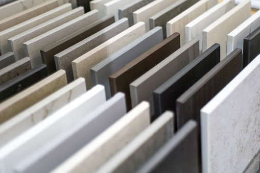
Below, you can see the range of colours available from Melteca and the number of customisation options you have when renovating your kitchen. Another brand that we work with which is quite similar to Melteca is Bestwood and they too carry a wide range of options in colours.
A sample range of Melteca colours that can be seen in our design studio in our kitchen showroom in Auckland
Samples of the Bestwood range in our design studio in our kitchen showroom in Auckland
All of the hinges used in our cabinetry is from Hafele and have a soft close set up.
Engineered stone benchtop and splashback in our kitchen showroom in Auckland
Creating continuity
One of the aims to create this kitchen display in our showroom was to show how it is in fact possible to create an aesthetically beautiful kitchen within a small space. Some of the ways to create an illusion of space in a small kitchen design is to create continuity. This was done in this kitchen by using a lighter shade in engineered stone for the splashback as well as benchtop above the already white cabinets.
Benchtop with a waterfall edge on one side
The benchtop and splashback are made of engineered stone with a polished finish. A polished finish just means that it is smooth to touch and it has a matte finish. It has a look of marble and have natural vein lines that you see naturally occurring in marble. in It is also 20mm in width and this width has started becoming popular in the last few years. The edge of one of the sides of the island has a waterfall edge which basically means that the engineered stone extends to the floor of the kitchen, hence the waterfall. This benchtop is from the mid range of engineered stone and not from the premium range that is used in our classic kitchen display discussed above. Using the mid-range engineered stone makes this kitchen more budget friendly as compared to our classic kitchen display.
Waterfall edge for one side of the island can be seen in our kitchen showroom in Auckland
Floating shelves, feature divider/wall and stainless steel open shelves – in our kitchen showroom in Auckland
Dorothy and Cici usually try and incorporate floating shelves in small kitchen spaces as it opens up the space and also adds to the aesthetics of the kitchen. If you had full top cabinetry in a small kitchen design then it will close the space up and make your kitchen look cumbersome. Hence, Dorothy decided to create one full length storage cabinetry in black and for part of the kitchen she decided to add black floating shelves to contrast with the white stone on the walls.
Black floating shelves with LED lights against a white stone wall adds interest to this small kitchen design
Drinks cabinet – Stainless steel frame with glass shelves
Dorothy also wanted to add another colour to the kitchen instead of just white and black to make it more appealing and to add a designer element to the kitchen. This drinks cabinet is made of brushed gold stainless steel frame and glass shelves and is a perfect way to display your glassware as well as drinks. This brushed gold colour also matches the tapware and chandelier found in this kitchen display in our kitchen showroom.
This drinks cabinet has a stainless steel frame in brushed gold/brass with glass shelves. This makes it a perfect display cabinet for drinks. This brushed gold also matches with the tapware as well as the chandelier in this kitchen – This can be seen in our kitchen showroom in Auckland
Feature wall – can be seen in our kitchen showroom in Auckland
Feature walls can be anything that is added on a wall for design purpose. It can be a wall that has designer tiles on it, wall paper or you can built an entirely separate walls that act as a divider.
The reason we built this feature wall is to show our clients that they can create dividers with their homes. It is also great for clients who have an open plan kitchen but do not want their kitchen to be fully visible from their living areas.
The feature wall of 4 vertical wooden beams can be seen next to the drinks cabinet in this design created by Dorothy
The kitchen display in our kitchen showroom shows the 4 vertical wooden beams next to the open drinks cabinet
Floating breakfast nook – extends out from the stone benchtop
Any kind of wooden element in any design brings some warmth in the kitchen to make it look cozy. This breakfast nook extends out of the benchtop and is attached on top of the benchtop. It creates a separate area for people to eat meals or even do for kids to do their homework.
The fact that it is a completely different material that is attached on to the benchtop also creates depth in kitchen and adds to its design.
The wooden looking breakfast nook that extends out from the benchtop. You can also see a wine fridge at the bottom left of the breakfast nook.
Elevation 2 of the breakfast nook – This can be seen in our Kitchen showroom in Auckland
Floating breakfast nook – what is this material made of?
The wooden benchtop is made of two different pieces of plywood that is joined together at 45 degree in a mitre joint to form a 50mm box. It is hollow inside so it is relatively light and can be easily attached to the benchtop without any strain on the stone.
We do not have bar stools for this kitchen display but we do plan to get them in the future. A sleek set of bar stools can be fit under the floating breakfast nook.
Brushed gold for the tap, stainless steel frame and feature chandelier
As Dorothy wanted to add some colour to this kitchen design, she decided to add 3 components with brushed gold. The feature chandelier, brass gold tapware and stainless steel frame are brass gold and even though they are not big components, they do add a great contrast.
Chandelier with brushed gold trimmings that match the U-shaped tap and frame of the open shelf
Brushed gold u-shaped tap matches the stainless steel frame of the drinks shelves and trimmings of chandelier. The nozzle at the end of the tap can be pulled out and stretches till the stainless sink.
Stainless steel frame with glass shelves of the drinks cabinet matches the tap as well as the chandelier
Neptune Waterproof Flooring from Tile Depot
All our kitchen displays as well as clients prefer installing Neptune flooring for wet areas because of its many benefits. This revolutionary flooring is a composite of polymer and limestone that happens to the strongest component of quartz. The limestone in Neptune flooring makes it 100% waterproof which is a great quality to have for your kitchen flooring.
It also resists the growth of bacteria, is stain resistant, scratch resistant, sound proof and soft on your feet. Dorothy chose a slightly lighter shade than the matte black kitchen for this kitchen design and it can be seen in the picture below.
As you can see the flooring in this kitchen looks like it is made of real wood and not engineered Neptune. It is also easier to maintain and will last you a longer time that other materials. This flooring can be seen in our kitchen showroom in Auckland.
Appliances in this kitchen
Dorothy used the standard induction cooktop and in built top rangehood for this kitchen from SMEG. This induction cooktop is from the mid-range of SMEG and not from the premium range like the one in the matte black kitchen she designed. The matte black kitchen was to showcase innovative materials and appliances but this was designed to fit into most budgets. The induction cooktop in the matte black kitchen does not remain hot once cooking is done so its safe to touch its surface. This induction cooktop however, does not have that safety feature and will remain hot for a few minutes after cooking is done. This means that you have to be careful if children are present in the kitchen.
Who is this type of kitchen design good for?
This kitchen is suitable for most families or even rental properties as it budget friendly and easy to maintain. Some of the materials are however, not stain resistant which means that it is advisable for you to wipe away and spills once you are finished cooking. Most spills will not stain the benchtop or cabinet fronts even if you do not wipe them straightaway.
However, spills like red wine, beetroot juice and turmeric should be wiped off sooner rather than later to avoid staining. This however may not be a great kitchen design for people who prefer more classic and traditional kitchen designs.
Where from now?
If you are looking for a kitchen renovation quote then the best way would be to ring us at 0800 199 888 to secure an on-site visit with a project manager. At the end of 3-4 days you will receive your detailed proposal as one complementary design of your kitchen.
Alternatively, we encourage you to visit our showroom at 16B Link drive, Wairau Valley where you can first hand look at the quality of our workmanship. You can also secure an on-site visit with the showroom consultants when you visit our showroom.
Further Resources
- Featured projects and Client stories to see specifications on some of the projects.
- Real client stories from Auckland
Need ideas? Check out our Kitchen Design Gallery or dive into our Bathroom Design Gallery for inspiration!
